Branding
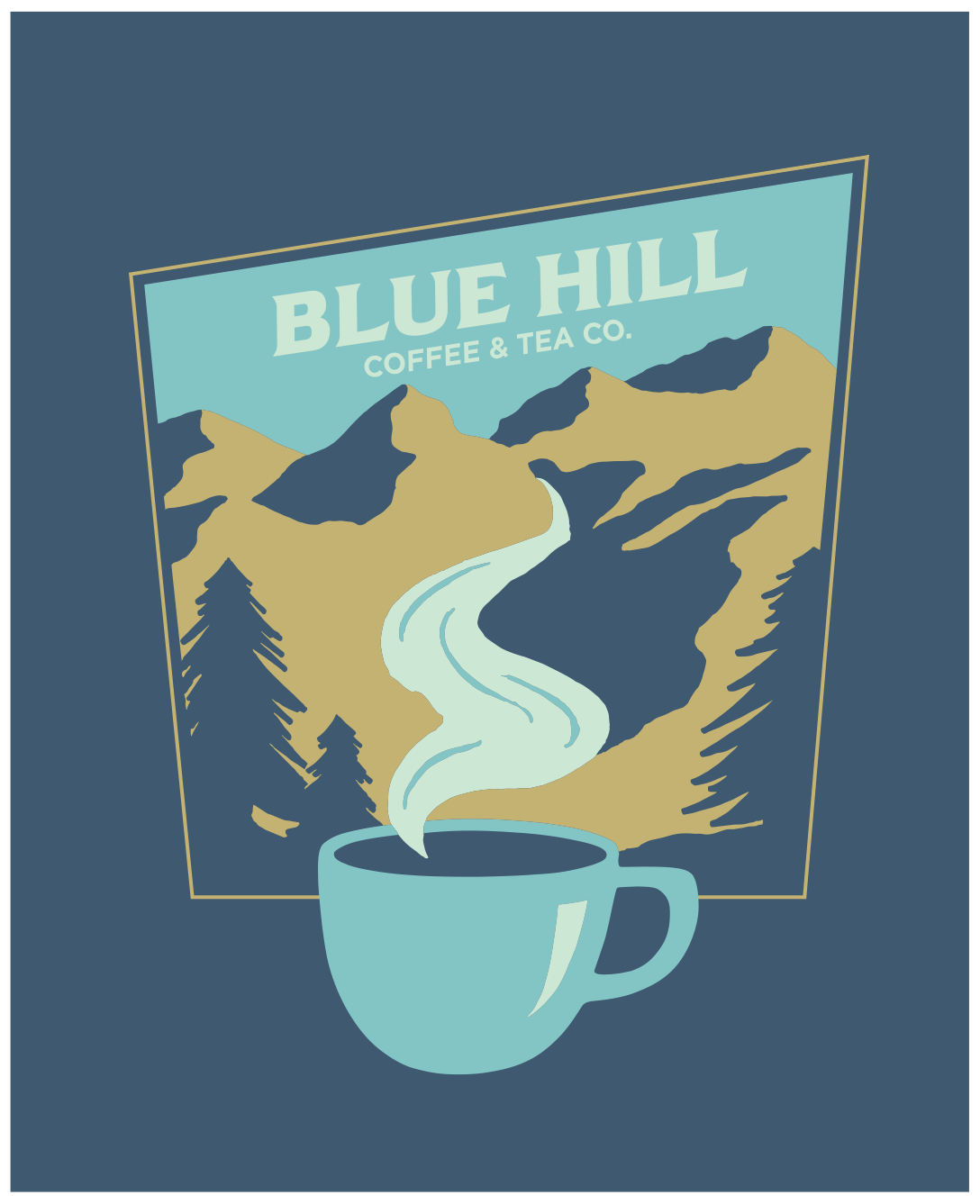
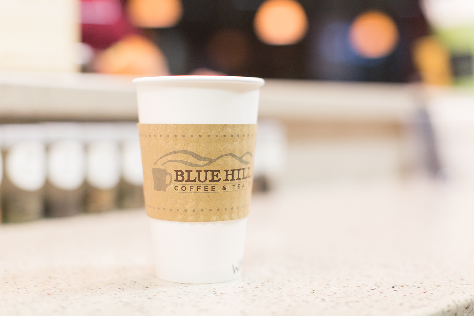
During the summer of 2014 I worked on branding a new coffee shop that was starting up on campus at Southern Wesleyan University. The Marketing team decided on the name of Blue Hill Coffee and Tea Co. I hand lettered and drew the logo to give it a rustic look.
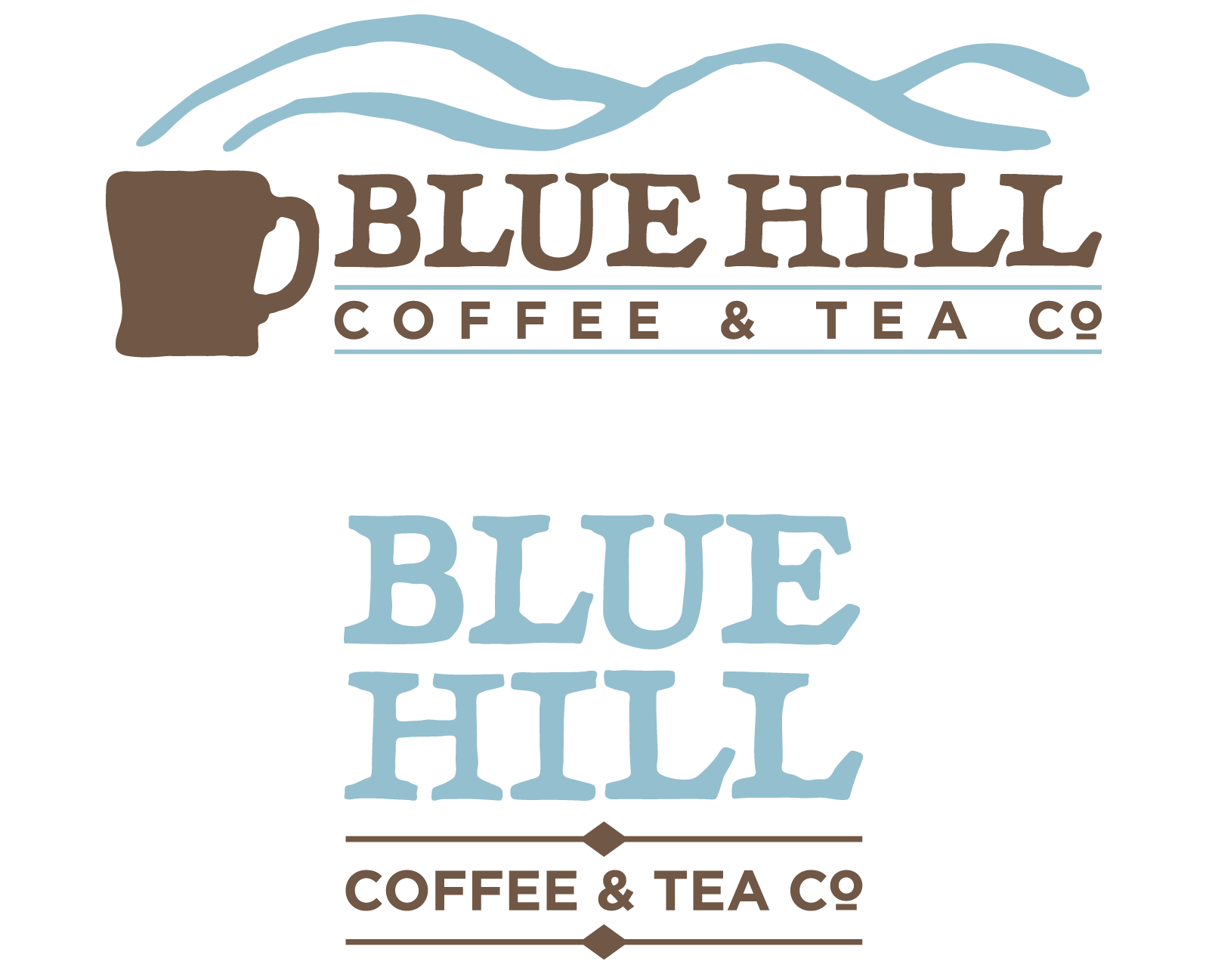
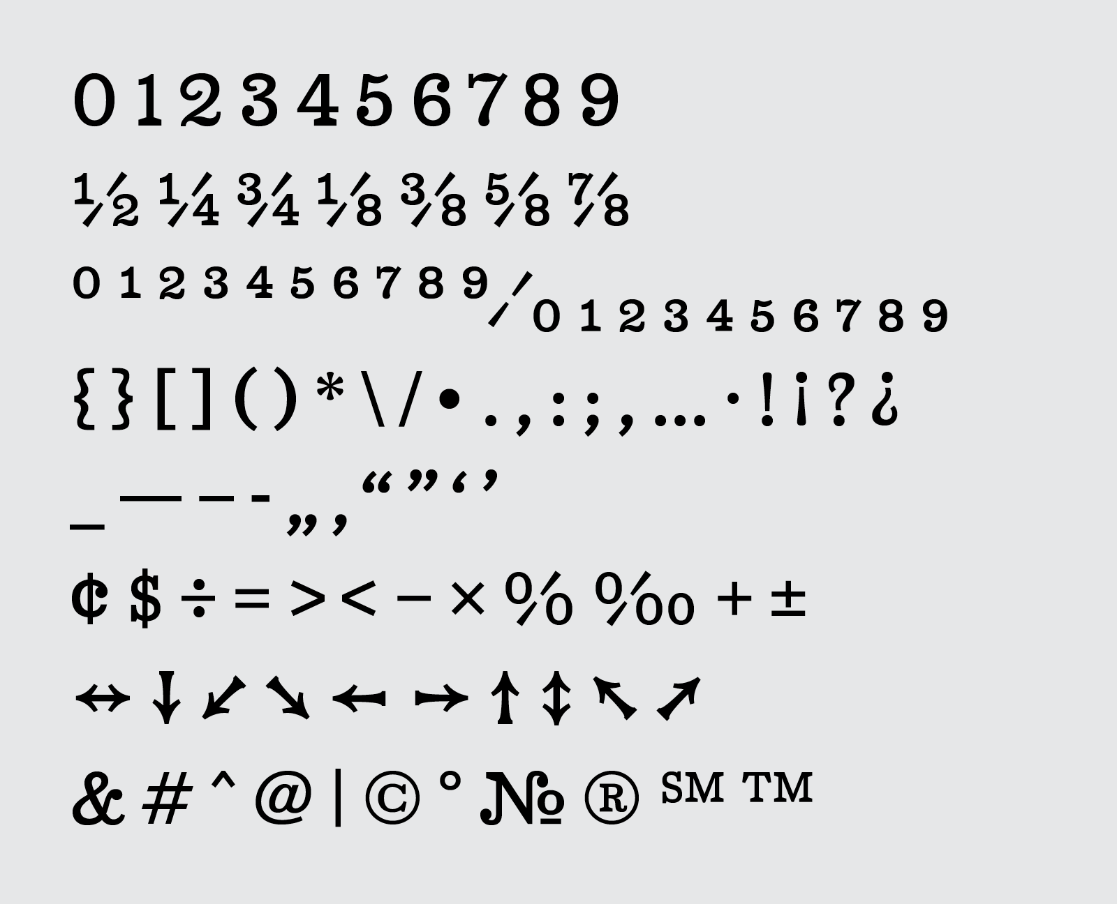
Once the logo was finalized I developed a typeface that could be used in the branding. I kept the chunky, oversized serifs from the logo type, electing to keep it more crude than refined. Design notes included "Would it look good on a burlap coffee sack?"
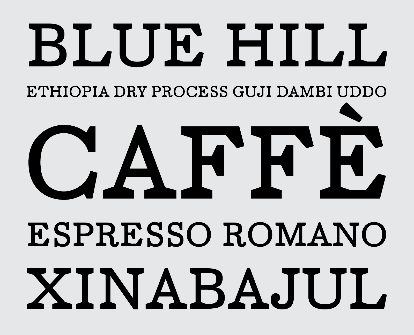
I decided to expand the character range to a full character set.
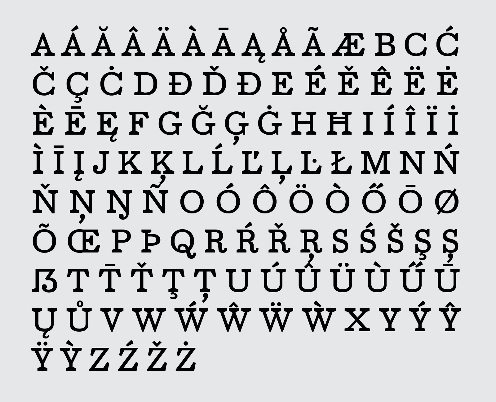
This included regular and monospace numerals, fractions and irregular fractions, standard punctuation, arrows, and symbols that would likely be used.
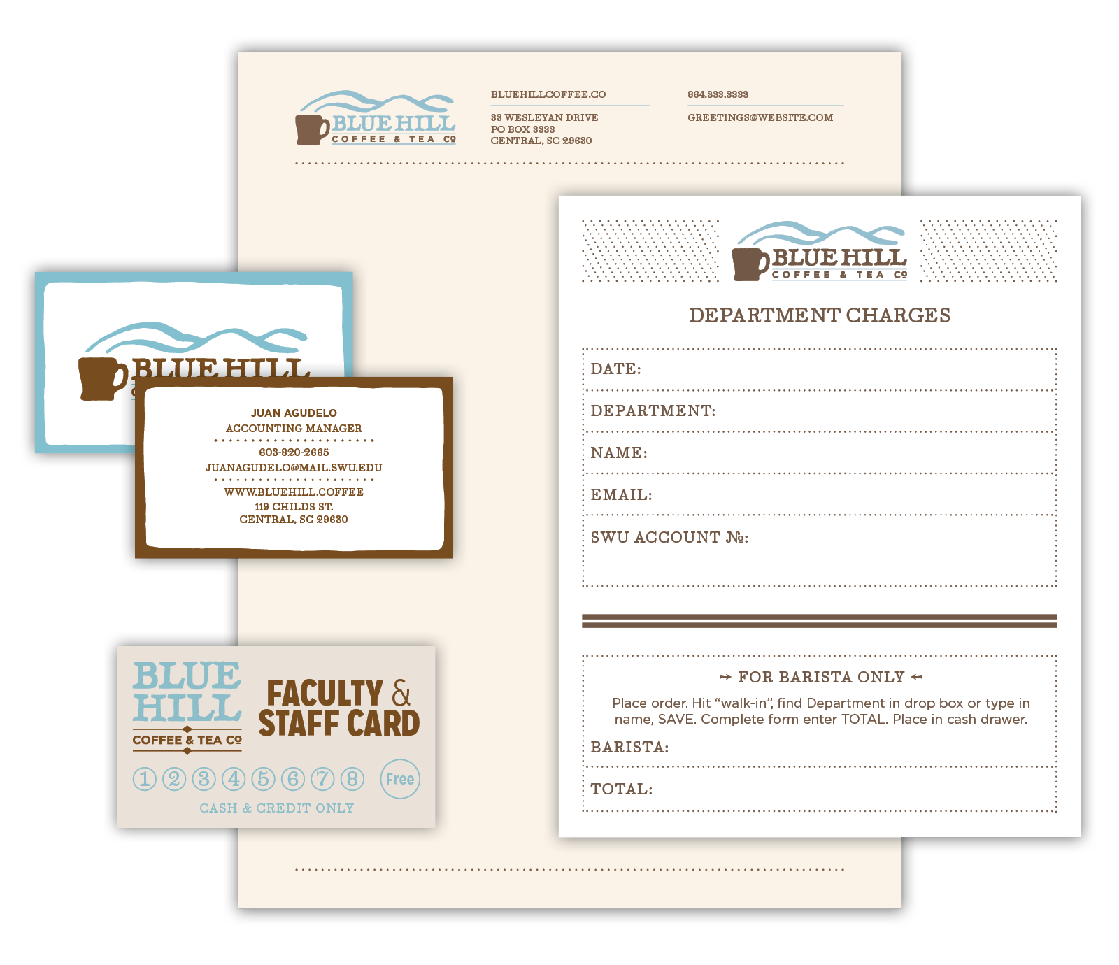
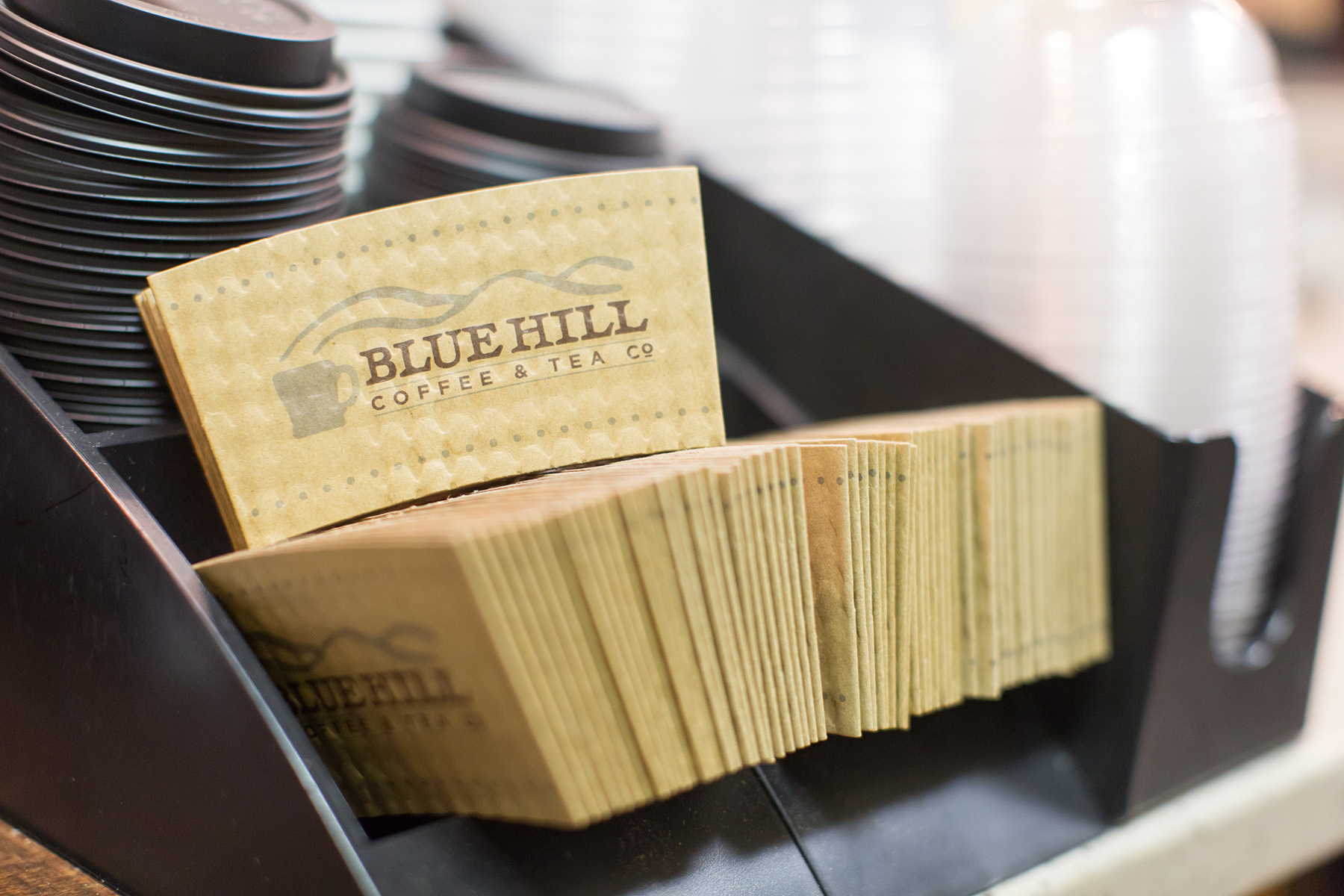
Collateral and other miscellaneous pieces were designed.
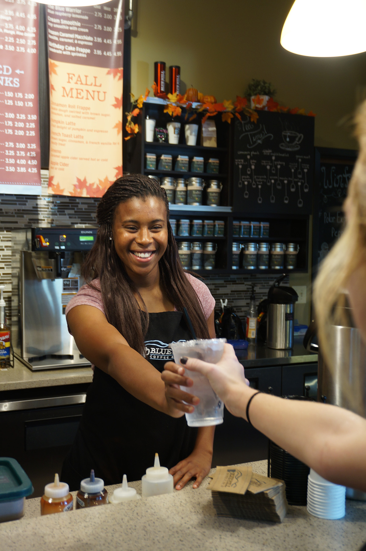
I also designed a shirt for the baristas. I created the illustration and used Ember Latin for the large type.